At first, I had a little difficulty coming up with what I wanted to do for my final project. I was tossing around a few ideas because I wanted to do something I haven't done before. I didn't want to redo older works for this because I wanted to do something that I haven't done yet. I had a text-based design I was going to try and work with for multiple images, but I didn't really have a strong direction to go in. Since this class has started, I have been really into photography. I looked through my phone (it has an 8 megapixel camera) at pictures I had taken recently. While on there, I found 6 photos from when I was near one of the lakes on campus. It was a beautiful day outside and the reflection of the skyline on the water caught my eye. I ended up taking some photos to capture the moment. When I rediscovered these photos, I was really happy with the way the original photos came out. I knew I could use them for something great, but I wasn't sure what I could do with them. Sure, I could just color correct them and call it a day, but that's what I did for the last project for the most part. I was trying to figure out what exactly I wanted to do with them. A little experimentation led me to choose the direction I wanted to pursue.
After trying a few things, I realized that there is a difference between a photograph and painting. Both have their own purpose and quality, but could a picture become a painting? I wanted to take the photos I had and make them into a different kind of art. I wanted break down the pictures of nature and recreate them into different expressions. I will put the original 6 photos later in this post so people can see the transformation. The goal of my project was to break out of the original view of photograph and experiment; I wanted to take the photos and completely change them. Some photos would have more detail than the others, but all would explore different strokes and different styles. I think that this project breaks down the boundaries of pictures vs. drawings/paintings. It helps to think outside the box and break down the walls. The story is a trip to the lake, but in a different perspective than the normal eye. All of the pictures are from the same location and the same trip when I was there. My story helps to document that experience and then creatively expand on it. I already had the pictures and it is time to edit the photos with Photoshop.
My target audience for this project is any art enthusiast. I am looking to make visually pleasing images that break the bounds of normal photography. I have seen similar techniques done by other artists and I wanted to give it a try. I think mine is distinct because I am trying multiple techniques on different but similar images. Also, each image will go through a wild transformation with strokes, colors, and other visual features.
Overall, here is my final idea for the project. I will take the 6 photos of the lake and transform them to look like paintings. I want to explore the idea of taking photos and changing them to create new images. I think that the audience will like to see the transformations and explore with their own photos.
2. Project Plan
My creative strategy is to add a filter and then experiment from there. Filters will add grain or strokes to the image. Other filters will simply the lines of the image or make it easier to add color. After the filters are applied, I will then adjust the colors in each image to help bring it together and make a new image from the original photograph. Each photo would have its own characteristics (a different filter or strokes added), but it will still be tied together from the overall theme. I will use Photoshop to make all of the adjustments. I used the camera on my phone to take all of the pictures. I did not adjust any of the settings on the phone. I will use the filters to start each image and then will use the adjustments to change the colors, brightness, etc. As for the timeline, I did each of the images one after the other to keep theme consistent and not stray too far from the path.
3. Production Log
For this section, I will show the original photo and then the image I made after the process was complete. All photos were taken on my phone's camera and adjusted in Photoshop.
Image #1


This was the first shot I took. I really liked how the gazebo was small, but still in the center of the shot. I wanted to preserve the emphasis on the gazebo but still enhance the photo. I first took this photo and added a filter. The Cutout filter simplified all of the lines and colors of the photo. This really helped to bring the piece together and place more focus on the gazebo. I then adjusted the colors using levels to adjust the red, green, and blue colors of the piece. I then added a cooling filter with a density of 28% to add a slight blue tilt to the image. I then used the curves adjustment to make the image brighter. Overall, the changes helped to add less color but a stronger and more unified palette. This new creation was very successful and it was a good way to start my creative vision.
Image #2


This is the second shot I took. This shot has a very nice direction to it. Your eye naturally goes to the lake and the trees creating the reflection. I really wanted to emphasize the many colors of the photo and add some texture to it. I first used a smart sharpen. Adding this gave the image some depth and gave me a lot to work with. This filter definitely made it look less a photo and more towards my creative vision. I then used the curves adjustment to adjust the overall RGB and the blues. This helped to darken and define all of the textures in the image. The blue tint helped to give me a direction to work with. I wanted the blue to be less prevalent, so I then added an orange photo filter with a 59% density to reduce the blue and warm up the image. I then used the levels to darken the image and finish it up. Overall, I was very happy with the way this image came out. This has more color than the other image, but has a different texture and still ties to the theme.
Image #3


This is the third shot I took. This shot showed the true power of nature. The reflective qualities of the lake allow for a stunning photograph. I wanted to enhance this characteristic while adding more color to the image. I first started by adding the poster edges filter. This filter added a lot of grain and noise to the image. This made it feel more like a drawing to me. From there, I wanted to enhance the colors. I next used the brightness/contrast adjustment and pushed the contrast up to 100 and moved the brightness up. This really brought out a lot of the color. I then used the vibrance adjustment to increase the vibrance and greatly increase the saturation. This last adjustment really made the colors a lot stronger and finished off the piece. Overall, I am very happy with this picture because it helped to define the power of the lake. You can see the darkened reflection in the lake that mirrors the trees.
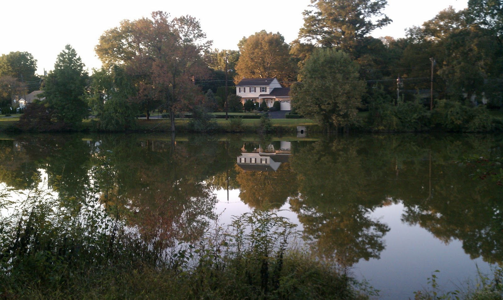
Image #4


This is the fourth shot I took that day. This picture has a house in the middle. I wanted this to be the focal point of the shot. I kept this in mind as I altered the photo. I started by using the Ink Outlines filter to add some noise and texture to the shot. It made it look a lot like a oil based painting sketched with a pencil. I then darkened and enriched the colors in the shot using the levels adjustment. I adjusted the RGB, green, and blue levels. The colors were darkened and more reds were apparent in the image. I then added a cyan color filter with a 45% photo filter to cool down the reds on the house and in the sky. I then adjusted the brightness and contrast to darken the image. The darkened image helped to make the house stand out more. I was very happy with the way this image came out. I really like the feel from this image.
Image #5

This is the fifth shot I took. I realized that this shot was similar to fourth shot, so I knew that I had to take it in a much different direction. I started by applying the Water Paper filter to add some texture to the shot. This filter helped to darken the background around the water and the house. The filter made an interesting texture pattern onto this image. At this point, the image was really lacking color. Even the original image did not have much. I then used the hue/saturation adjustment to make the change. Adjusting the master hue, saturation, and lightness added the colors into the water (the blues and the other colors in the reflection) and it helped color the house. I then used the levels adjustment to adjust the reds and the greens. After this, I achieved the final project. I liked how this one came out. It was a nice photo, but the new image is really enhanced.
Image #6


This is the sixth shot I took. At this point, I needed to keep the theme the same, but find a way to make this picture different. It was hard for me to pick a direction for this shot that was similar to theme but different than the rest. I started by adding the grain filter to this shot. From there, I had a difficult time coming up with the next move. I finally decided to use the levels adjustment to adjust the red, blue, and greens. This added a yellowish hue over the image. I liked the direction it was going in, so I continued. I then used the curves adjustment to adjust the greens and blues. This darkened the yellowish hue over the image. It gave the image an older feel. I then used the brightness/contrast adjustment and increased both. This adjustment helped to separate the bright sky from the now darker trees and it helped to enhance the reflection in the water. Overall, I'm not 100% on this one, but I like the fact that I was able to do something a little different with this one. I'm glad it's not too similar to the rest.
4. Self-Evaluation
Overall, I am happy with the way this project came out. I think it's a valuable technique to use in certain situations. It's nice to know that sometimes you can do more than just color correction to truly enhance an image. I think the project was very successful in the fact that I did everything that I wanted. I think the 6th image may be the weakest for the story of the project, but I would like to continue to work on this one at some point. I think exploring the different filters first is a good technique because it inspires a direction for each image. Each image is different in that regard, but they all have a filter, thus bringing them together. All of the images have different colors and unique aspects, which is something that I am very happy with. I think this technique would not work in all circumstances, however. These lake shots worked, but beach shots or shots of buildings might not work as well. I am interested in trying out these techniques on new photos that I have taken since completing this project. I have some shots of the beach and other bodies of water. I have some shots of towns and buildings. I think this is just a new way to approach pictures when you can't think of anything else. It's a good brainstorming tool that can eventually become something wonderful. If I were to do this again, I would make sure I have 6 different shots. Some of my shots looked very similar, so it made it more difficult to have them stand out. I think with 6 different shots, I would be able to be a little more successful, but overall, I am happy for my first try with this.
No comments:
Post a Comment