
Tuesday, December 13, 2011
Final Movie
Here is the link to the Final Movie I made. Some changes needed to be made. I color corrected the main shots (the longer lasting ones) to help counteract the lighting of the window. I also added a few transitions and adjusted some of the keynotes. I also played with the audio of the guitar playing part since it was not consistent throughout the entire project. I made adjustments to the levels, gains, and frequencies of some of the clips Overall, these changes helped to make a big different with the video. I am happy with the way this project came out.

Wednesday, December 7, 2011
Final Movie - Project Proposal, Upgraded Storyboard
This post with discuss two major things associated with my latest film project: the project proposal and the upgraded storyboard.
Project Proposal
When I was thinking of a movie idea, I wanted to do something that I haven't done before. While at a meeting for PSE (the Marketing/Sales Frat on campus), we discussed our ongoing sales project. We were selling chocolate bars; not the most extensive sale, but one that could encourage our members to explore different sales techniques. As the VP of PR, I am always thinking of new ways to brand our club on campus. As I thought about how we could advertise for this sale, the idea of making a commercial came into my head. It was something that we (as a club) haven't done before, so I was breaking new ground. The goal of this project was to explore new video editing techniques and to help sell the chocolate bars. I had the general idea, now I needed to explore the possibilities. I asked fellow club members to work with me on the commercial, but unfortunately, no one was able to help out. I was going to take a camera out of the IMM building, but it was raining outside (another disappointment ha). I didn't want to risk taking the equipment outside in the rain. To get the idea down, I decided to record the video on my personal computer. My MacBook Pro has a built in camera and I wanted to see how good the recording quality was. So, I took all of my shots with the camera in my room. I also chose to do it this way because it gave the video more of a personal touch and more like everyday life. I want PSE to be like that as well; just a group of motivated students looking to continuously improve themselves and the organization that they are a part of. Since I was by myself, I decided that my project should involve talking to myself. I think it would be interesting to have multiple shots laid on top of each other all interacting. I would sit in different positions and take a combination of shots from close up to long shots to make all of the difference. I knew that I would have fun with this project.
My target audience is TCNJ students. Chocolate is a very popular candy and homemade chocolate is even more desired. Old Monmouth Candies are relatively unknown outside of the Monmouth County area, but they are delicious. It was important for us to get the word out as much as possible to increase our sales and maximize our profit. My prior film experience helped to influence this project. The NYC video I made helped me work out layering videos and pictures in one workplace. That video allowed me to try something different and not be afraid, having confidence is half the battle with most projects. I think this is a unique project because talking to yourself is an unusual concept. Having a main me and then multiple versions of myself pop up out of no where is something out of the ordinary. Also, singing a song about chocolate is something different. I didn't originally plan on doing this, but some how I found inspiration and wrote music. I have also never recorded myself playing guitar on my computer's video camera, so that was exciting.
Overall, this project will help explore new technologies, techniques, and help sell some delicious chocolate. I was very excited to get this going.
Updated Storyboard


This is the upgraded storyboard. The last one was hand-drawn and difficult to follow. These pictures will help to show my creative process. All of the shots on the storyboard were used in the film, but additional shots were added in as I saw fit.
Project Proposal
1) Initial idea and complete proposal:
When I was thinking of a movie idea, I wanted to do something that I haven't done before. While at a meeting for PSE (the Marketing/Sales Frat on campus), we discussed our ongoing sales project. We were selling chocolate bars; not the most extensive sale, but one that could encourage our members to explore different sales techniques. As the VP of PR, I am always thinking of new ways to brand our club on campus. As I thought about how we could advertise for this sale, the idea of making a commercial came into my head. It was something that we (as a club) haven't done before, so I was breaking new ground. The goal of this project was to explore new video editing techniques and to help sell the chocolate bars. I had the general idea, now I needed to explore the possibilities. I asked fellow club members to work with me on the commercial, but unfortunately, no one was able to help out. I was going to take a camera out of the IMM building, but it was raining outside (another disappointment ha). I didn't want to risk taking the equipment outside in the rain. To get the idea down, I decided to record the video on my personal computer. My MacBook Pro has a built in camera and I wanted to see how good the recording quality was. So, I took all of my shots with the camera in my room. I also chose to do it this way because it gave the video more of a personal touch and more like everyday life. I want PSE to be like that as well; just a group of motivated students looking to continuously improve themselves and the organization that they are a part of. Since I was by myself, I decided that my project should involve talking to myself. I think it would be interesting to have multiple shots laid on top of each other all interacting. I would sit in different positions and take a combination of shots from close up to long shots to make all of the difference. I knew that I would have fun with this project.
My target audience is TCNJ students. Chocolate is a very popular candy and homemade chocolate is even more desired. Old Monmouth Candies are relatively unknown outside of the Monmouth County area, but they are delicious. It was important for us to get the word out as much as possible to increase our sales and maximize our profit. My prior film experience helped to influence this project. The NYC video I made helped me work out layering videos and pictures in one workplace. That video allowed me to try something different and not be afraid, having confidence is half the battle with most projects. I think this is a unique project because talking to yourself is an unusual concept. Having a main me and then multiple versions of myself pop up out of no where is something out of the ordinary. Also, singing a song about chocolate is something different. I didn't originally plan on doing this, but some how I found inspiration and wrote music. I have also never recorded myself playing guitar on my computer's video camera, so that was exciting.
Project plan:
My creative strategy is that I want to keep the video looking simple, but a lot going on. The MacBook camera and my dorm room as the setting will help to give it that feel. The project will look like a homemade film, but with a professional and visually appealing flair. I think that it will achieve the feel I was going for. The song will also add something that will be easily memorable. It will help to provide some more entertainment value for the video. My technical strategy is that I am going to keep it simple. I will use the MacBook to film and Final Cut Pro to do all of the editing. I will use different layering techniques to have the different videos of myself talking and interacting with each other. As for time, I wanted to have all the shots done in the same day for the sake of consistency. It's hard to have the room look the exact same during two different sessions. After that, all color correction and edits will be made when available.
My creative strategy is that I want to keep the video looking simple, but a lot going on. The MacBook camera and my dorm room as the setting will help to give it that feel. The project will look like a homemade film, but with a professional and visually appealing flair. I think that it will achieve the feel I was going for. The song will also add something that will be easily memorable. It will help to provide some more entertainment value for the video. My technical strategy is that I am going to keep it simple. I will use the MacBook to film and Final Cut Pro to do all of the editing. I will use different layering techniques to have the different videos of myself talking and interacting with each other. As for time, I wanted to have all the shots done in the same day for the sake of consistency. It's hard to have the room look the exact same during two different sessions. After that, all color correction and edits will be made when available.
Production log:
I set up the shots so that the primary shot would have me in the middle. After filming the first shot (approx. 30 seconds), I then set up the shots with myself looking at the camera in different angles and perspectives. This allowed me to look at myself at all times. I visually planned for myself to be in six potential locations, 3 on the left and 3 on the right. I then took the shots with that in mind. All different shots and speaking lines would be done from those six different perspectives and combined later while editing the video. I then took some shots of the chocolate, me eating the chocolate, dancing, guitar playing, and general excitement. The combination of these shots will make the project work well. Since I wanted to keep it simple, I filmed it from the perspective of looking at my desk, looking out into the world. The elements in my room helped to give it that feel, such as the poster and closet in the background. I wasn't overly dressed up and I was just myself, which help add to the theme of the commercial. I made my storyboard and filled all of the shots on there. I then had some time left over, so I felt the need to shoot more. These additional shots came in handy as it helped add some more content to the overall production. I used the MacBook Pro camera and Final Cut Pro to complete this project. While editing, I discovered the ability to use keynoting to change the opacity of the mini-shots. This allowed them to smoothly fade in and out. The next steps involved putting all of the pieces into place and making sure all of it lined up. After that, the video was complete.
I set up the shots so that the primary shot would have me in the middle. After filming the first shot (approx. 30 seconds), I then set up the shots with myself looking at the camera in different angles and perspectives. This allowed me to look at myself at all times. I visually planned for myself to be in six potential locations, 3 on the left and 3 on the right. I then took the shots with that in mind. All different shots and speaking lines would be done from those six different perspectives and combined later while editing the video. I then took some shots of the chocolate, me eating the chocolate, dancing, guitar playing, and general excitement. The combination of these shots will make the project work well. Since I wanted to keep it simple, I filmed it from the perspective of looking at my desk, looking out into the world. The elements in my room helped to give it that feel, such as the poster and closet in the background. I wasn't overly dressed up and I was just myself, which help add to the theme of the commercial. I made my storyboard and filled all of the shots on there. I then had some time left over, so I felt the need to shoot more. These additional shots came in handy as it helped add some more content to the overall production. I used the MacBook Pro camera and Final Cut Pro to complete this project. While editing, I discovered the ability to use keynoting to change the opacity of the mini-shots. This allowed them to smoothly fade in and out. The next steps involved putting all of the pieces into place and making sure all of it lined up. After that, the video was complete.
4) Self-evaluation:
Overall, this project was a success. The video helped with our sales and it was very well received. Many people found the video to be funny and encouraged me to continuing working on videos for the organization. I was very happy with how the project came together in Final Cut Pro. All of the pieces worked very well together and the humor of the video is well established. The video also had the feel that I was going for. I wish I could have shot it again as I shot it behind a window, which adds a weird glow behind me which could potentially distract a viewer. I also wish that I had a microphone to record the audio as it was not as clear as expected. Overall, I am excited to make more videos and commercials. It will be a very exciting career option for me. I will like to make more videos where I interact with myself.
Overall, this project was a success. The video helped with our sales and it was very well received. Many people found the video to be funny and encouraged me to continuing working on videos for the organization. I was very happy with how the project came together in Final Cut Pro. All of the pieces worked very well together and the humor of the video is well established. The video also had the feel that I was going for. I wish I could have shot it again as I shot it behind a window, which adds a weird glow behind me which could potentially distract a viewer. I also wish that I had a microphone to record the audio as it was not as clear as expected. Overall, I am excited to make more videos and commercials. It will be a very exciting career option for me. I will like to make more videos where I interact with myself.
Updated Storyboard


This is the upgraded storyboard. The last one was hand-drawn and difficult to follow. These pictures will help to show my creative process. All of the shots on the storyboard were used in the film, but additional shots were added in as I saw fit.
Monday, November 28, 2011
Video 3
For this next project, I decided to make a commercial for the club I am in on campus. The commercial is for Pi Sigma Epsilon's chocolate sale that is going on now. Our first step with the project was to create storyboards. Here they are:


 These storyboards outline the shots in the commercial. For this commercial, I decided to essentially have a conversation with myself. I would talk to different panels of me to explain what PSE is selling. Each square demonstrates the type of shot and how it would look. Storyboards really help with the planning process as they let you visualize your work before you go out and shoot it. These storyboards were a big help in filming the commercial.
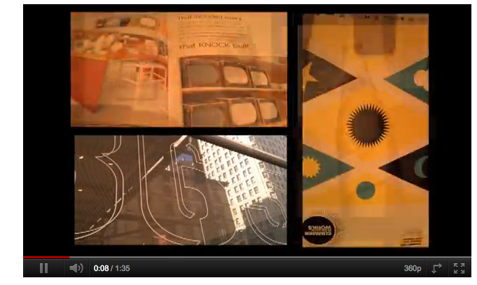
Here is the final video: http://www.youtube.com/watch?v=NDTmcWKGvY4
Here are some photos from the video:


 I filmed this commercial with the camera on my MacBook Pro and edited the commercial in Final Cut Pro. As you can see, it took a lot of coordination to plan out each head movement and perspective of the shot. I had to make sure that all of the shots lined up correctly and that all of the eye-lines were correct, as demonstrated in my storyboard. As you watch the commercial, you will see the different shots of me and the chocolate fade in and out. This was done utilizing key frames and opacity. I set the opacity to 0 as the shot ended to slowly fade it out. This was a better solution than transitions which can be too intense at times. Overall, I was very happy with the way this video came out at and I look forward to continuing my experiments with time-based media.


Here is the final video: http://www.youtube.com/watch?v=NDTmcWKGvY4
Here are some photos from the video:


Wednesday, November 16, 2011
Video 2 Redo
I made a change to this video. See the new one here:
http://www.youtube.com/watch?v=8LAc6NkLYTI
I took the first section and removed the cross fades from the individual pics from the art exhibit. It made the switches between them easier for people to watch. It has been received with a positive reaction.
http://www.youtube.com/watch?v=8LAc6NkLYTI
I took the first section and removed the cross fades from the individual pics from the art exhibit. It made the switches between them easier for people to watch. It has been received with a positive reaction.
Video 2
For this video, I focused in on taking some footage I had of NYC and going beyond my comfort zone with film. I had a whole bunch of different layers and videos/pictures going on at once. It was a lot of experimentation. I filmed this with the camera on my phone. I wanted to give it a handycam feel. I wanted to take the typical tourist video of New York and see where I could take it. Find a link to the video here:
http://www.youtube.com/watch?v=_ByTC5GcwWs
Here are some shots from the film:


This movie was divided up into three different sections. The first section was the art exhibit. I used a video shot of me walking as a transitions between the parts. It is also the beginning and the ending to tie the movie together. For the art exhibit, I did not have any video shots. I had some pictures of different pieces at the exhibition and I wanted to arrange them all in different ways. I decided to put three pictures up at once for a short period of time. I wanted the pictures to move around the screen. Shots of the name of the exhibit are static in the shot, but the pieces move around the screen. It works well with the tempo of the song. The photos have a nice movement to them as they shift around the screen. I liked the way this came out as it was kind of like an "out-of-the-ordinary" slideshow.
The second section was a piece of public art I saw while walking around. It was a room full of these colored cups. It was a beautiful display. What really caught my attention, though, was the action behind the art. Watching the people and cars moving behind it provided a stunning visual effect. I decided to replicate this by first filming for over 30 seconds as a background. I then took over 30 shots within 2 minutes to give a stop motion effect when put together. I then overlaid the pictures on top of the video to give a very unusual effect. Each picture is on the screen for less than a second. The picture of the exhibit then fades up as the video shot ends. I was very happy with the way this came out.
The third section was a collection of videos and pictures I took while walking around the city. I decided to combine the techniques I used previously in the film and put them all on top of each other. I had a combination of video(s) and picture(s) on the screen at once. All of them are switching and fading into each other. It is really visually stimulating as it is interesting to follow the progression of a day through the shots. Many sights of the city are shown on the screen at once, compressing a 4 hour trip into less than a minute of video footage. Some of the shots and layers are not perfectly even, but I intended to do that to give the movie some depth. It helped change it up from the norm. I am happy with this section, but I am unsure if I would do a technique similar to this in the future.
Overall, I was very satisfied with the way this video came out. This was very new for me and I look forward to working with these techniques in the future. In the future, I would work with a better camera than my phone because it has some problems with focus and lighting at times.
Video 1
In class, we have now moved on to video. Here is the link to the final project I made:
http://www.youtube.com/watch?v=-DpmicJsG8k
For this video, we just needed to demonstrate some basic editing techniques. I wanted to give it a handycam feel to make it more of a personal connection for other people to continue working with this movement if I decide to pursue it. I ended up using my phone's camera to film. It was good to know how that works and the importing process. I simply have to drag the files into Final Cut Pro as opposed to capturing.


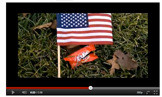


I framed each shot by putting the American flag by each piece of garbage I found. As you can see in each of the shots, the flag is either placed on the garbage, next to the garbage, or planted vertical next to it. I white balanced with a preset option on my phone's camera, but some of the shots were darker than others. It it one of the imperfections of the phone, but this is all part of the learning process. Overall I found over 15 pieces of different trash in about a half hour of walking, which says a lot about how often people litter. In the final piece, I did not do any color correction, but if I were to redo this project, I will make adjustments to make the shots look better. I added transitions between the shots to make the video more interesting and playful. I want it to be personable and make it look like anyone could do in their spare time. I would never use transitions in that manner in a tradition sense, unless I was going for a specific effect. Overall, I was happy about this project for what it was, but I look forward to improving my film making and making better shots.
http://www.youtube.com/watch?v=-DpmicJsG8k
For this video, we just needed to demonstrate some basic editing techniques. I wanted to give it a handycam feel to make it more of a personal connection for other people to continue working with this movement if I decide to pursue it. I ended up using my phone's camera to film. It was good to know how that works and the importing process. I simply have to drag the files into Final Cut Pro as opposed to capturing.


I framed each shot by putting the American flag by each piece of garbage I found. As you can see in each of the shots, the flag is either placed on the garbage, next to the garbage, or planted vertical next to it. I white balanced with a preset option on my phone's camera, but some of the shots were darker than others. It it one of the imperfections of the phone, but this is all part of the learning process. Overall I found over 15 pieces of different trash in about a half hour of walking, which says a lot about how often people litter. In the final piece, I did not do any color correction, but if I were to redo this project, I will make adjustments to make the shots look better. I added transitions between the shots to make the video more interesting and playful. I want it to be personable and make it look like anyone could do in their spare time. I would never use transitions in that manner in a tradition sense, unless I was going for a specific effect. Overall, I was happy about this project for what it was, but I look forward to improving my film making and making better shots.
Tuesday, October 18, 2011
The Midterm
1. Initial Idea and Complete Proposal
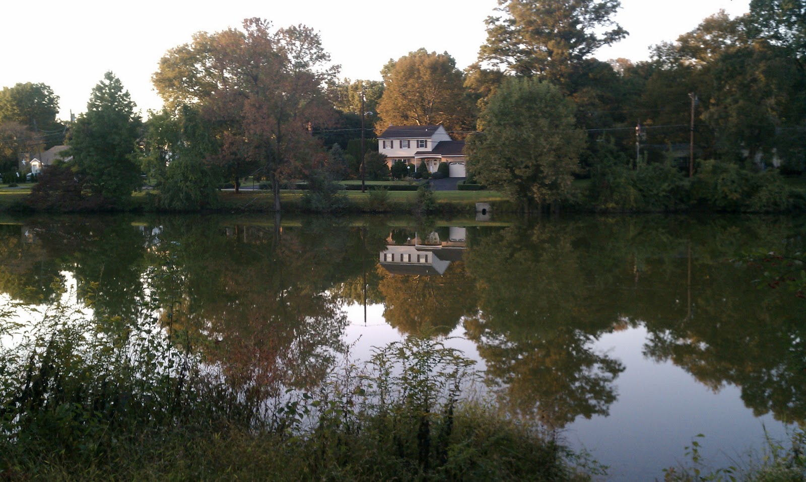
At first, I had a little difficulty coming up with what I wanted to do for my final project. I was tossing around a few ideas because I wanted to do something I haven't done before. I didn't want to redo older works for this because I wanted to do something that I haven't done yet. I had a text-based design I was going to try and work with for multiple images, but I didn't really have a strong direction to go in. Since this class has started, I have been really into photography. I looked through my phone (it has an 8 megapixel camera) at pictures I had taken recently. While on there, I found 6 photos from when I was near one of the lakes on campus. It was a beautiful day outside and the reflection of the skyline on the water caught my eye. I ended up taking some photos to capture the moment. When I rediscovered these photos, I was really happy with the way the original photos came out. I knew I could use them for something great, but I wasn't sure what I could do with them. Sure, I could just color correct them and call it a day, but that's what I did for the last project for the most part. I was trying to figure out what exactly I wanted to do with them. A little experimentation led me to choose the direction I wanted to pursue.
After trying a few things, I realized that there is a difference between a photograph and painting. Both have their own purpose and quality, but could a picture become a painting? I wanted to take the photos I had and make them into a different kind of art. I wanted break down the pictures of nature and recreate them into different expressions. I will put the original 6 photos later in this post so people can see the transformation. The goal of my project was to break out of the original view of photograph and experiment; I wanted to take the photos and completely change them. Some photos would have more detail than the others, but all would explore different strokes and different styles. I think that this project breaks down the boundaries of pictures vs. drawings/paintings. It helps to think outside the box and break down the walls. The story is a trip to the lake, but in a different perspective than the normal eye. All of the pictures are from the same location and the same trip when I was there. My story helps to document that experience and then creatively expand on it. I already had the pictures and it is time to edit the photos with Photoshop.
My target audience for this project is any art enthusiast. I am looking to make visually pleasing images that break the bounds of normal photography. I have seen similar techniques done by other artists and I wanted to give it a try. I think mine is distinct because I am trying multiple techniques on different but similar images. Also, each image will go through a wild transformation with strokes, colors, and other visual features.
Overall, here is my final idea for the project. I will take the 6 photos of the lake and transform them to look like paintings. I want to explore the idea of taking photos and changing them to create new images. I think that the audience will like to see the transformations and explore with their own photos.
2. Project Plan
My creative strategy is to add a filter and then experiment from there. Filters will add grain or strokes to the image. Other filters will simply the lines of the image or make it easier to add color. After the filters are applied, I will then adjust the colors in each image to help bring it together and make a new image from the original photograph. Each photo would have its own characteristics (a different filter or strokes added), but it will still be tied together from the overall theme. I will use Photoshop to make all of the adjustments. I used the camera on my phone to take all of the pictures. I did not adjust any of the settings on the phone. I will use the filters to start each image and then will use the adjustments to change the colors, brightness, etc. As for the timeline, I did each of the images one after the other to keep theme consistent and not stray too far from the path.
3. Production Log
For this section, I will show the original photo and then the image I made after the process was complete. All photos were taken on my phone's camera and adjusted in Photoshop.
Image #1


This was the first shot I took. I really liked how the gazebo was small, but still in the center of the shot. I wanted to preserve the emphasis on the gazebo but still enhance the photo. I first took this photo and added a filter. The Cutout filter simplified all of the lines and colors of the photo. This really helped to bring the piece together and place more focus on the gazebo. I then adjusted the colors using levels to adjust the red, green, and blue colors of the piece. I then added a cooling filter with a density of 28% to add a slight blue tilt to the image. I then used the curves adjustment to make the image brighter. Overall, the changes helped to add less color but a stronger and more unified palette. This new creation was very successful and it was a good way to start my creative vision.
Image #2


This is the second shot I took. This shot has a very nice direction to it. Your eye naturally goes to the lake and the trees creating the reflection. I really wanted to emphasize the many colors of the photo and add some texture to it. I first used a smart sharpen. Adding this gave the image some depth and gave me a lot to work with. This filter definitely made it look less a photo and more towards my creative vision. I then used the curves adjustment to adjust the overall RGB and the blues. This helped to darken and define all of the textures in the image. The blue tint helped to give me a direction to work with. I wanted the blue to be less prevalent, so I then added an orange photo filter with a 59% density to reduce the blue and warm up the image. I then used the levels to darken the image and finish it up. Overall, I was very happy with the way this image came out. This has more color than the other image, but has a different texture and still ties to the theme.
Image #3


This is the third shot I took. This shot showed the true power of nature. The reflective qualities of the lake allow for a stunning photograph. I wanted to enhance this characteristic while adding more color to the image. I first started by adding the poster edges filter. This filter added a lot of grain and noise to the image. This made it feel more like a drawing to me. From there, I wanted to enhance the colors. I next used the brightness/contrast adjustment and pushed the contrast up to 100 and moved the brightness up. This really brought out a lot of the color. I then used the vibrance adjustment to increase the vibrance and greatly increase the saturation. This last adjustment really made the colors a lot stronger and finished off the piece. Overall, I am very happy with this picture because it helped to define the power of the lake. You can see the darkened reflection in the lake that mirrors the trees.
Image #4


This is the fourth shot I took that day. This picture has a house in the middle. I wanted this to be the focal point of the shot. I kept this in mind as I altered the photo. I started by using the Ink Outlines filter to add some noise and texture to the shot. It made it look a lot like a oil based painting sketched with a pencil. I then darkened and enriched the colors in the shot using the levels adjustment. I adjusted the RGB, green, and blue levels. The colors were darkened and more reds were apparent in the image. I then added a cyan color filter with a 45% photo filter to cool down the reds on the house and in the sky. I then adjusted the brightness and contrast to darken the image. The darkened image helped to make the house stand out more. I was very happy with the way this image came out. I really like the feel from this image.
Image #5

This is the fifth shot I took. I realized that this shot was similar to fourth shot, so I knew that I had to take it in a much different direction. I started by applying the Water Paper filter to add some texture to the shot. This filter helped to darken the background around the water and the house. The filter made an interesting texture pattern onto this image. At this point, the image was really lacking color. Even the original image did not have much. I then used the hue/saturation adjustment to make the change. Adjusting the master hue, saturation, and lightness added the colors into the water (the blues and the other colors in the reflection) and it helped color the house. I then used the levels adjustment to adjust the reds and the greens. After this, I achieved the final project. I liked how this one came out. It was a nice photo, but the new image is really enhanced.
Image #6


This is the sixth shot I took. At this point, I needed to keep the theme the same, but find a way to make this picture different. It was hard for me to pick a direction for this shot that was similar to theme but different than the rest. I started by adding the grain filter to this shot. From there, I had a difficult time coming up with the next move. I finally decided to use the levels adjustment to adjust the red, blue, and greens. This added a yellowish hue over the image. I liked the direction it was going in, so I continued. I then used the curves adjustment to adjust the greens and blues. This darkened the yellowish hue over the image. It gave the image an older feel. I then used the brightness/contrast adjustment and increased both. This adjustment helped to separate the bright sky from the now darker trees and it helped to enhance the reflection in the water. Overall, I'm not 100% on this one, but I like the fact that I was able to do something a little different with this one. I'm glad it's not too similar to the rest.
4. Self-Evaluation
Overall, I am happy with the way this project came out. I think it's a valuable technique to use in certain situations. It's nice to know that sometimes you can do more than just color correction to truly enhance an image. I think the project was very successful in the fact that I did everything that I wanted. I think the 6th image may be the weakest for the story of the project, but I would like to continue to work on this one at some point. I think exploring the different filters first is a good technique because it inspires a direction for each image. Each image is different in that regard, but they all have a filter, thus bringing them together. All of the images have different colors and unique aspects, which is something that I am very happy with. I think this technique would not work in all circumstances, however. These lake shots worked, but beach shots or shots of buildings might not work as well. I am interested in trying out these techniques on new photos that I have taken since completing this project. I have some shots of the beach and other bodies of water. I have some shots of towns and buildings. I think this is just a new way to approach pictures when you can't think of anything else. It's a good brainstorming tool that can eventually become something wonderful. If I were to do this again, I would make sure I have 6 different shots. Some of my shots looked very similar, so it made it more difficult to have them stand out. I think with 6 different shots, I would be able to be a little more successful, but overall, I am happy for my first try with this.
Subscribe to:
Posts (Atom)